My concentration theme is the different elements that make up a city. I will demonstrate the different parts and activities of a city with diptics, movement, emphasis, space and many other principles. I have always loved cities and how two different feelings can all be incorporated into one theme.
First off, loved the pictures! I loved the angles you took them and the space in the pictures. I think you could of improved on some maybe trying effects, so some can pop out a little more of others. But overall I loved them!
Nice work, I really like the final 12 images. One thing I might do is add more contrast in your 7th photo. I like the strong shapes and lines that you have throughout your concentration.
Let me just say that I love all of these pictures and I would totally buy them from you. You have a great sense of point of view and composition in all of your pictures. My only suggestions would be to mess with contrast and shadow in images 7 and 11, just to make them pop a little more.
Love all of them ! nicely taken and the point of view is really good. On the 5th one the photo on the right I feel like its a little blurry. But other then that everything is nicely taken.
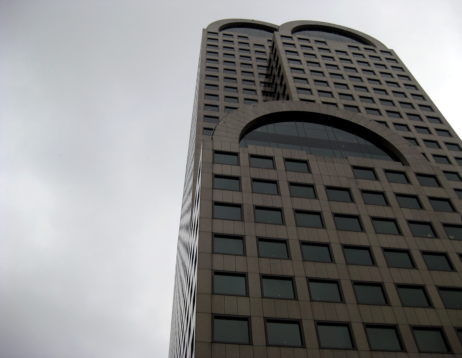
This is a great collection! Each photo captures the mood of a busy city very well and there is great lighting in every photo. There are similar points of view in the images, so that really ties the collection together. If I were to change anything, I would edit some of the skyscraper photos in Photoshop. It would be nice to have more contrast in some of them. Good job!
Your theme is really cool, and well taken. I like the mood of all of the pictures, and I think they all work really well seperately or as a group. I would agree with Haley in that you could increase the contrast in a few of them to make them stand out even more, but other than that I think they are fantastic.
I really like the theme! Most of the photos are extremely clear and the angles are very interesting. In the 6th photo you could add more saturation in order to really boost the rich brick color. Good job :)
The theme of your concentration is really cool, and demonstrated really well in your images. I would agree to work with some contrast on some of the images just to make them pop more. I love the first picture, its my favorite!
I agree with everyone else, you display your concentration really well. I like how you show a lot of space and figure ground along with texture. The one of the red brick building doesn't feel as strong as your others but I think you have a strong concentration.
I love that your pictures are all so clear, althought i would agree that mabey play a bit with the contrast or color in the some of the pictures. but other then that, great job :)
I love the elements that you used in this concentration: space, figure-ground, etc. There's a couple images that dont quite fit with the rest, and i think that if you strengthed thier quality, it would be a flawless portfolio.
I love the principles of design that you used in your pictures. A lot of them are very open, which fits perfectly with your theme. I agree with everyone else though, some pictures where a little fuzzy, and some of them were dark as well. Try to play with the contrast, exposure, and saturation to make your pictures bright and pop out. Great job though!
andrea, i really like your concentration idea and i think your images are strong, i like what you chose for your images, it really feels like those are parts that make up a city. great work kid.


First off, loved the pictures! I loved the angles you took them and the space in the pictures. I think you could of improved on some maybe trying effects, so some can pop out a little more of others. But overall I loved them!
ReplyDeleteNice work, I really like the final 12 images. One thing I might do is add more contrast in your 7th photo. I like the strong shapes and lines that you have throughout your concentration.
ReplyDeleteI love all of these! I don't know what to change! I would try adding some color to your ninth image in photoshop
ReplyDeleteLet me just say that I love all of these pictures and I would totally buy them from you. You have a great sense of point of view and composition in all of your pictures. My only suggestions would be to mess with contrast and shadow in images 7 and 11, just to make them pop a little more.
ReplyDeleteLove all of them ! nicely taken and the point of view is really good. On the 5th one the photo on the right I feel like its a little blurry. But other then that everything is nicely taken.
ReplyDeleteThis is a great collection! Each photo captures the mood of a busy city very well and there is great lighting in every photo. There are similar points of view in the images, so that really ties the collection together. If I were to change anything, I would edit some of the skyscraper photos in Photoshop. It would be nice to have more contrast in some of them. Good job!
ReplyDeleteYour theme is really cool, and well taken. I like the mood of all of the pictures, and I think they all work really well seperately or as a group. I would agree with Haley in that you could increase the contrast in a few of them to make them stand out even more, but other than that I think they are fantastic.
ReplyDeleteI really like the theme! Most of the photos are extremely clear and the angles are very interesting. In the 6th photo you could add more saturation in order to really boost the rich brick color. Good job :)
ReplyDeleteThe theme of your concentration is really cool, and demonstrated really well in your images. I would agree to work with some contrast on some of the images just to make them pop more. I love the first picture, its my favorite!
ReplyDeleteThis portrays Seattle perfectly! I love this idea, very original. I like all the different color schemes, they match your subject matter really well.
ReplyDeleteI agree with everyone else, you display your concentration really well. I like how you show a lot of space and figure ground along with texture. The one of the red brick building doesn't feel as strong as your others but I think you have a strong concentration.
ReplyDeleteI love that your pictures are all so clear, althought i would agree that mabey play a bit with the contrast or color in the some of the pictures. but other then that, great job :)
ReplyDeleteI love the elements that you used in this concentration: space, figure-ground, etc. There's a couple images that dont quite fit with the rest, and i think that if you strengthed thier quality, it would be a flawless portfolio.
ReplyDeleteWhich pictures were you thinking don't quite fit with the rest?
DeleteI love the principles of design that you used in your pictures. A lot of them are very open, which fits perfectly with your theme. I agree with everyone else though, some pictures where a little fuzzy, and some of them were dark as well. Try to play with the contrast, exposure, and saturation to make your pictures bright and pop out. Great job though!
ReplyDeleteandrea, i really like your concentration idea and i think your images are strong, i like what you chose for your images, it really feels like those are parts that make up a city. great work kid.
ReplyDelete